Rizz Wireless

Tone of Voice: Irreverent, humorous, uplifting, with Gen Z slang baked in. Think memes-meet-motivation.
Visual Language: Bright gradients, surreal mash-ups, hyperreal 3D renders, dreamlike collages—where reality bends into possibility.


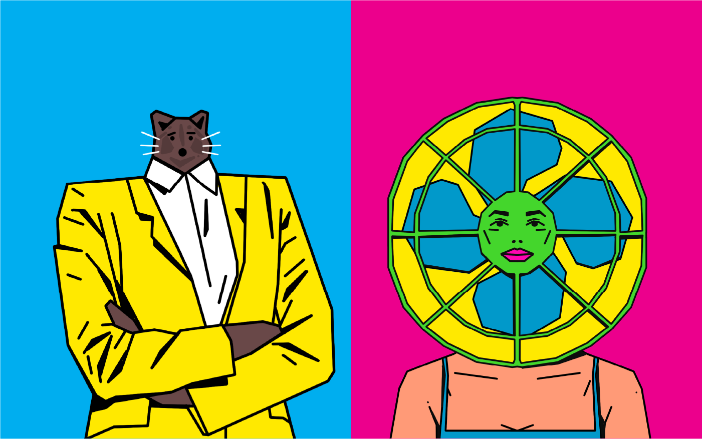


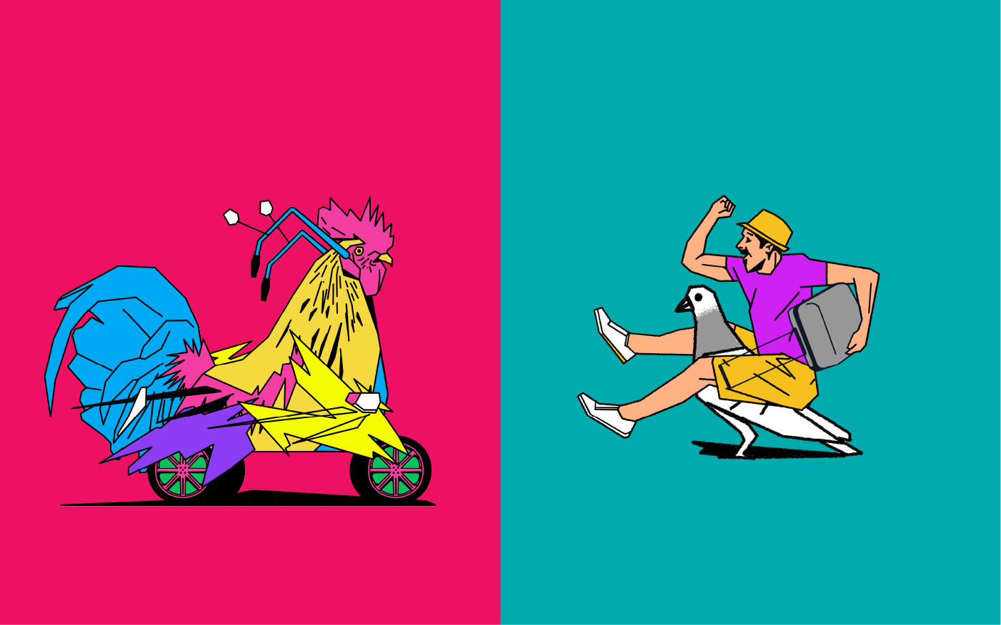

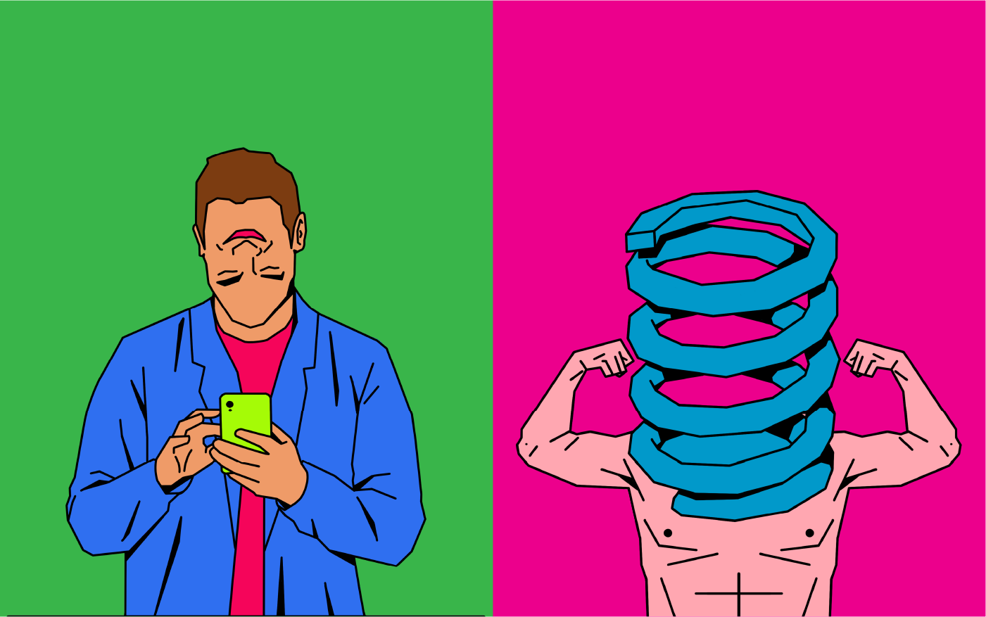


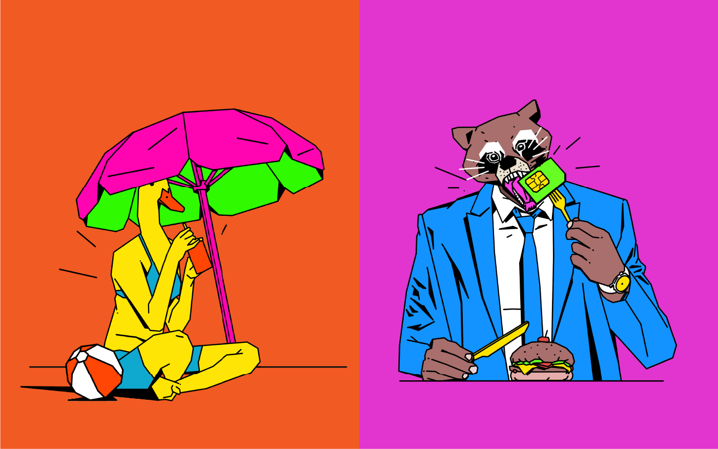



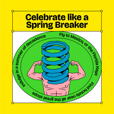
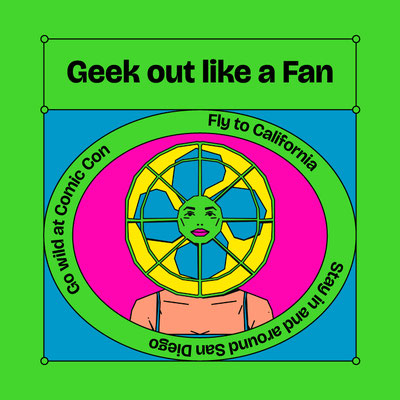
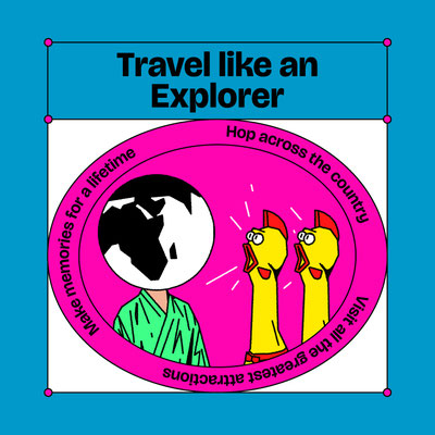


To embody hope as limitless possibility, the brand taps into surreality. The world of Rizz is where imagination and absurdity
collide—showing that hope means believing in the impossible.

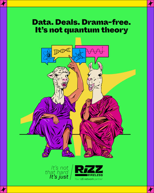
Moves away from the corporate seriousness of telecoms into a brand that feels human, optimistic, and relatable.
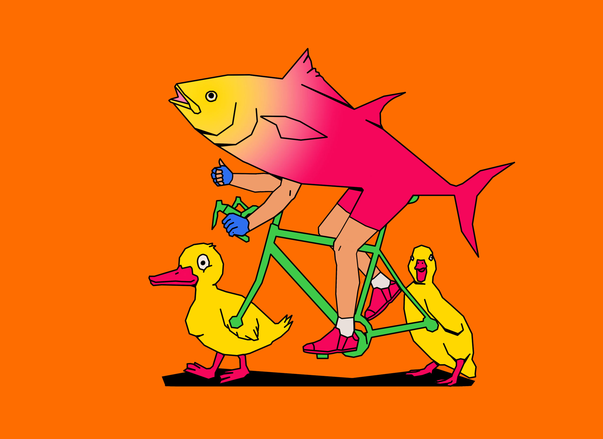
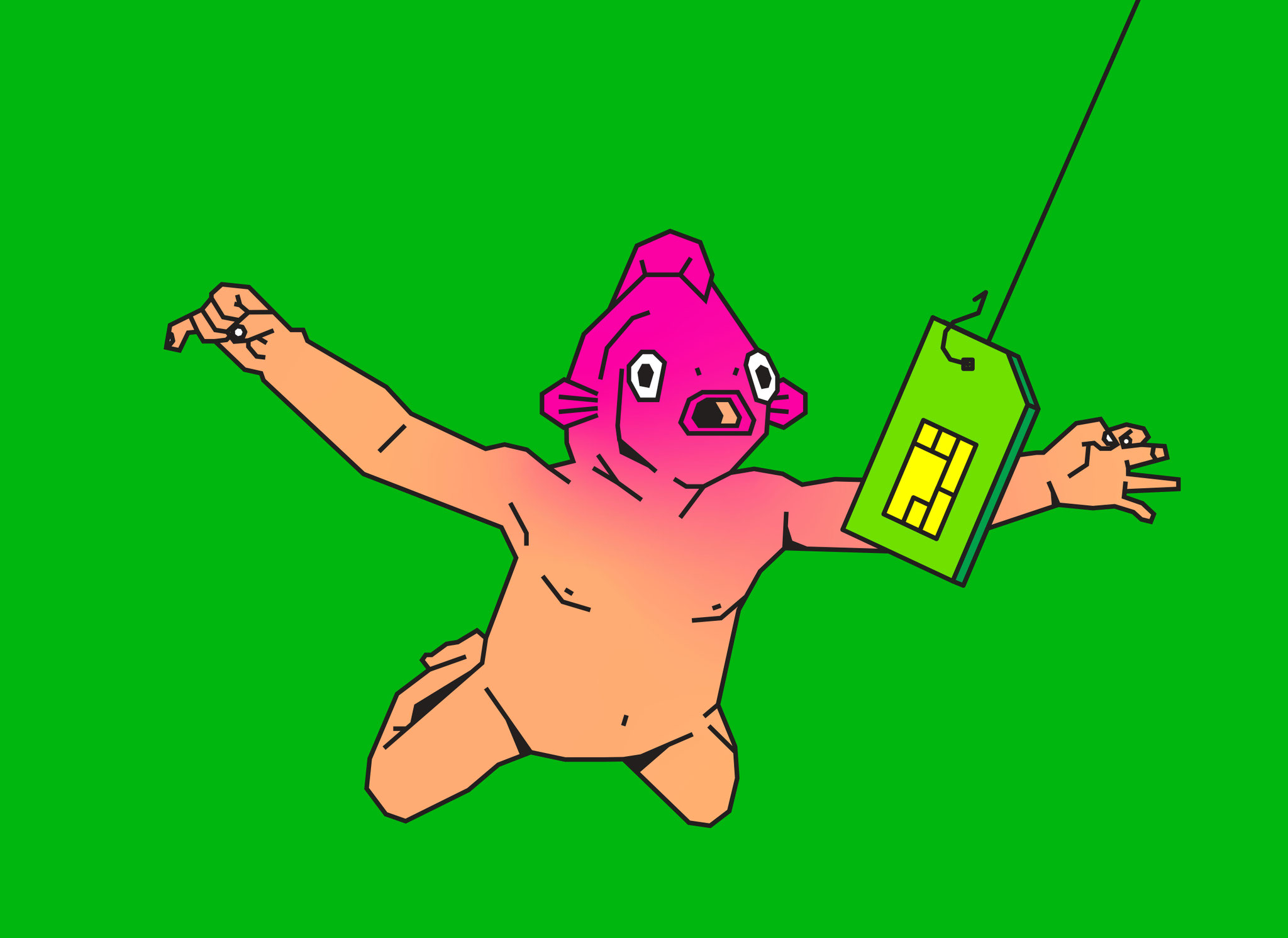
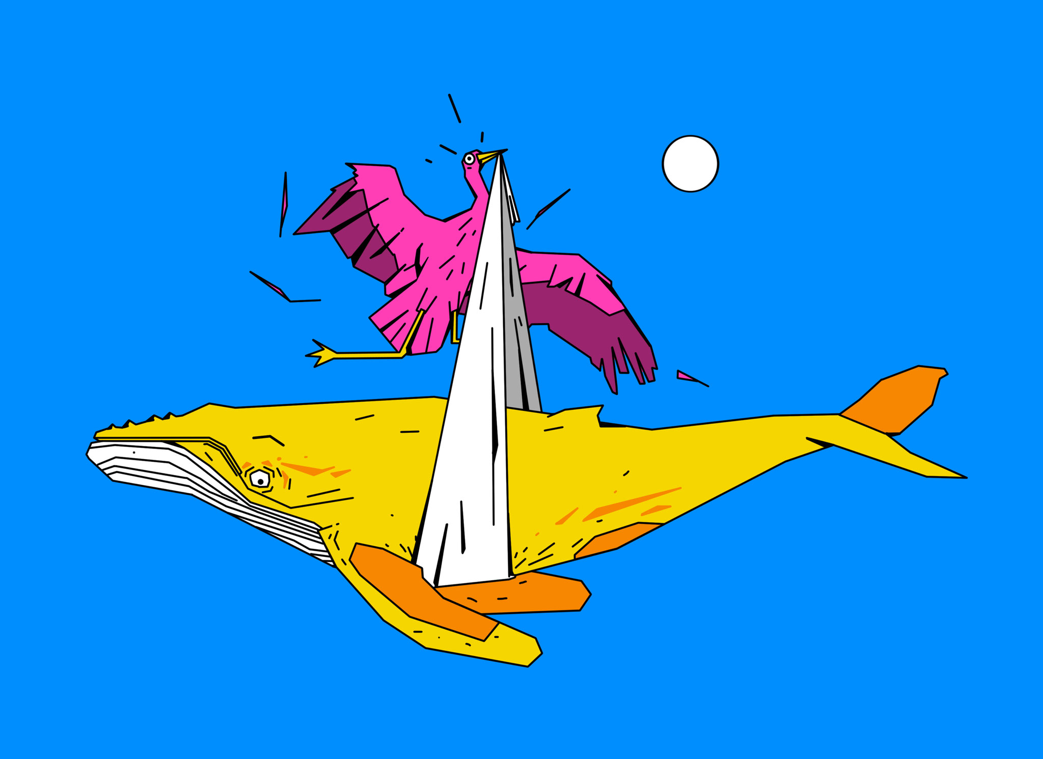



With Rizz Wireless, we’re not just building a brand, we’re building a world where hope lights the way and even the impossible feels within reach.
Karigar Records
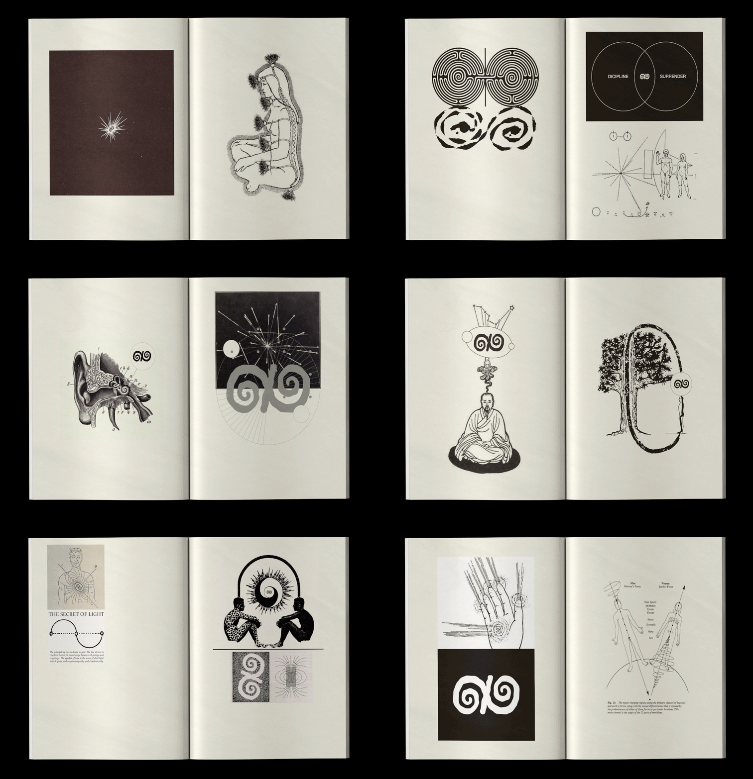
Skip-a-Beat: Record Label.
Skip a beat is an independent record label & online radio show from India
Its a monthly show that takes you on a hour long journey of sound by some of
The finest music producers from India and around the subcontinent,
With handcrafted beats by Sprky aka Tejas acting as the glue that holds it together.

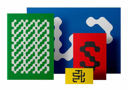

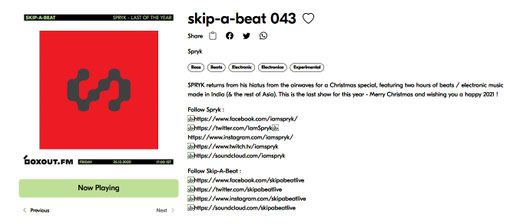
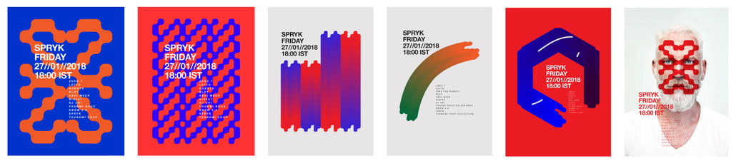
Graphics for there monthly shows. Applying the logo in various combination permutation to form endless results.
















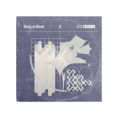
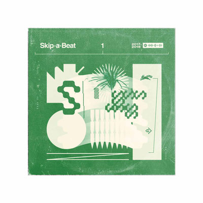
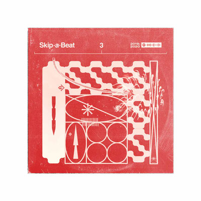
Cover Images for labels annual release.
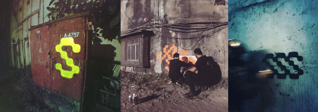
As a part of guerilla marketing we took the brand on the streets creating public murals to create brand awareness.
Kranti Art Theory
curators of indian underground music and illustration scene.






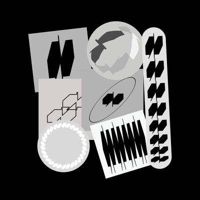

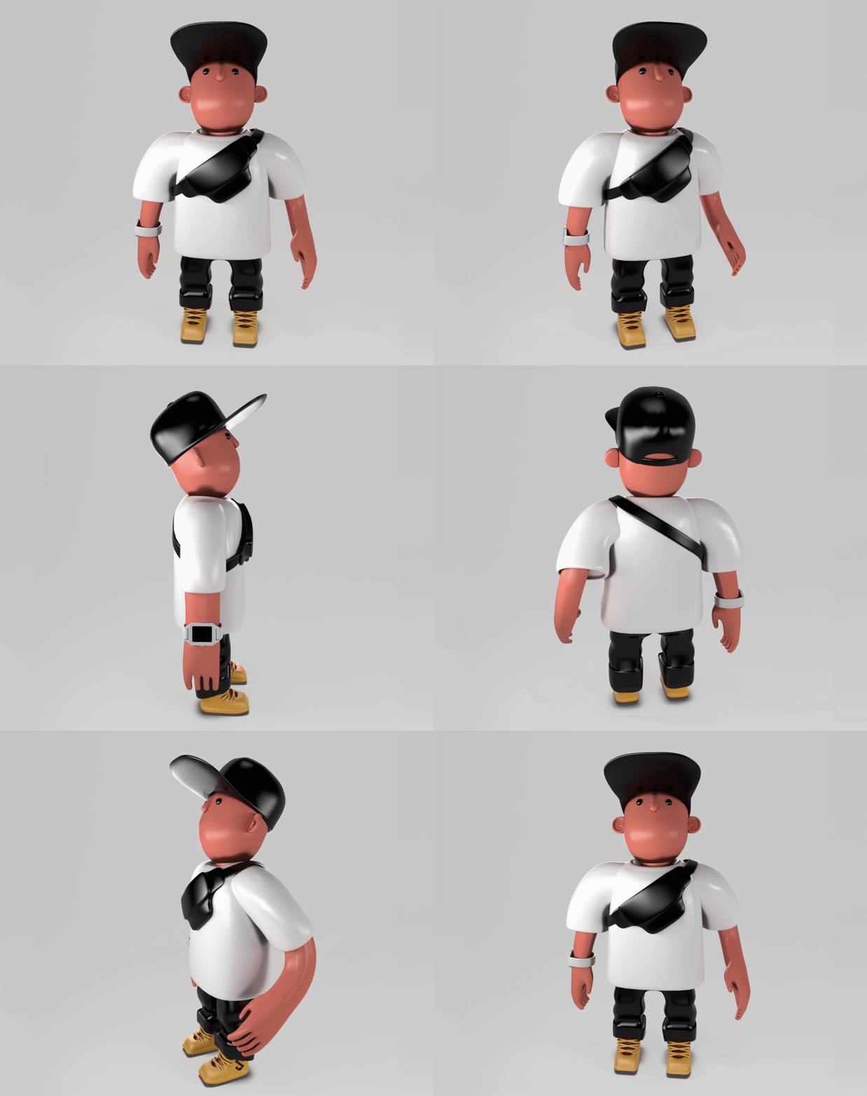
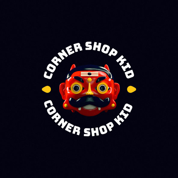
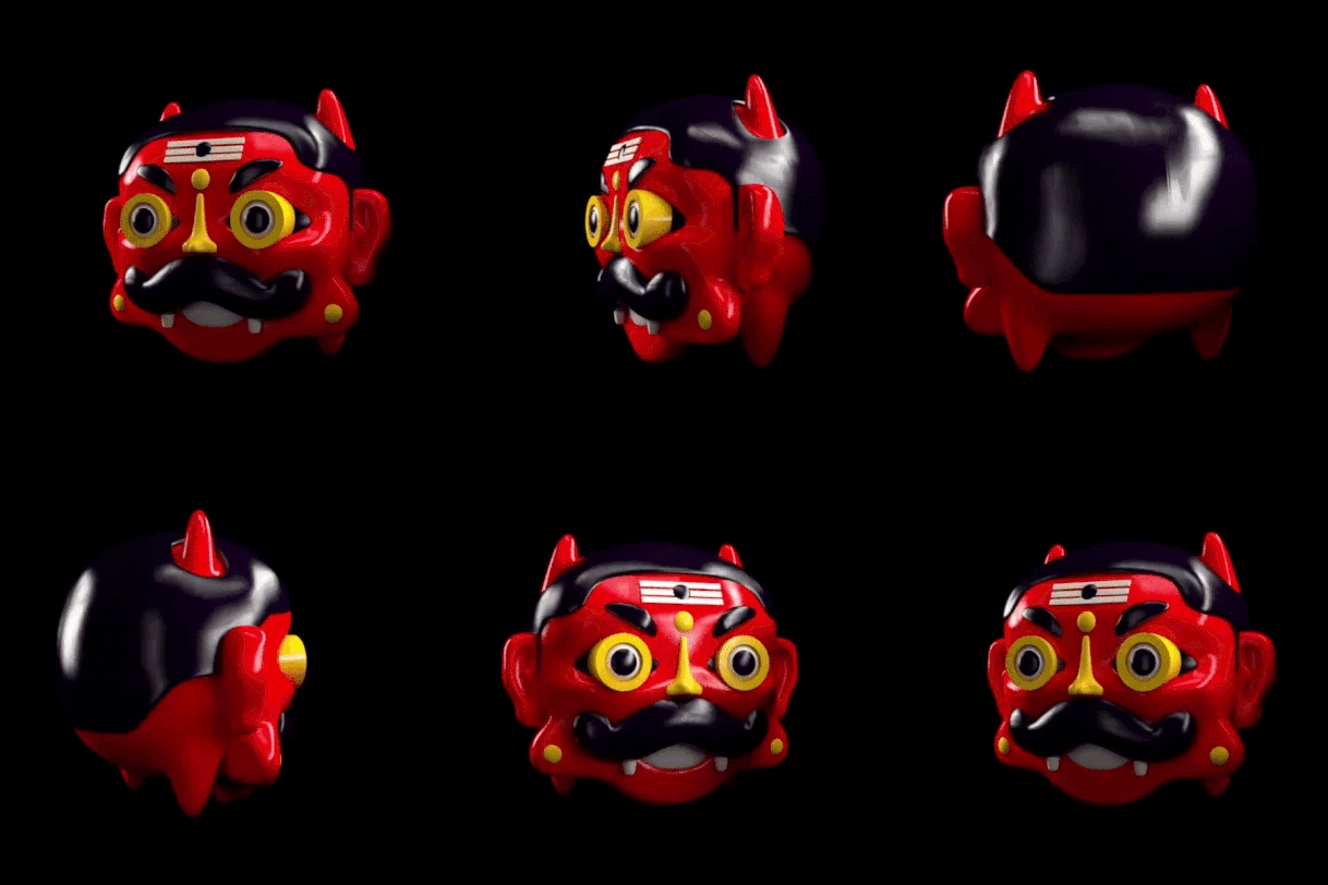
Corner Shop Kid
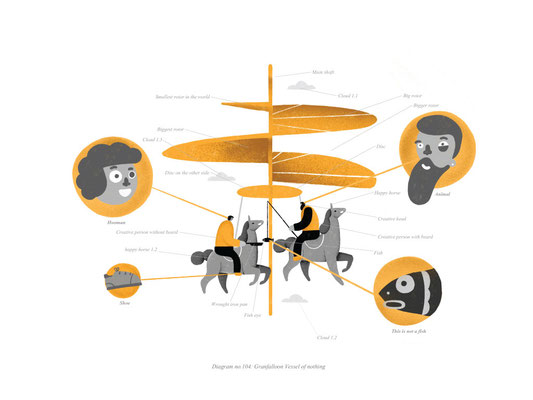
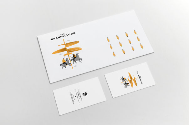
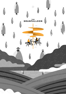
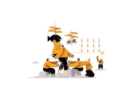
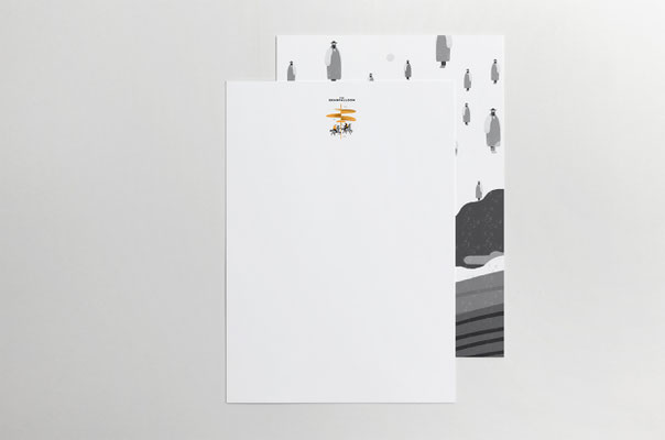
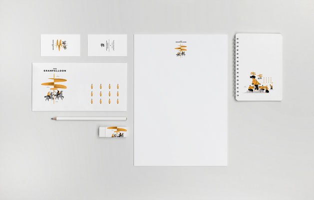
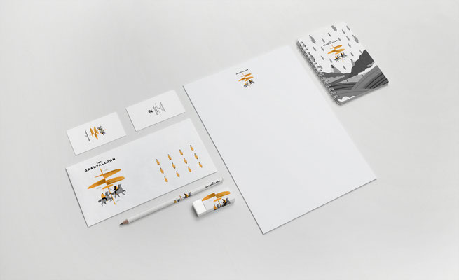
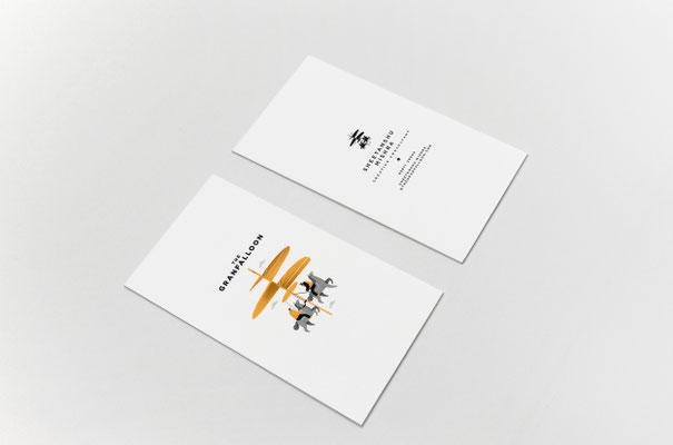
The Granfaloon
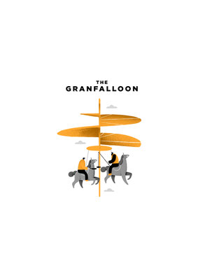
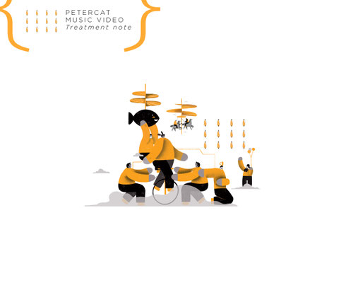
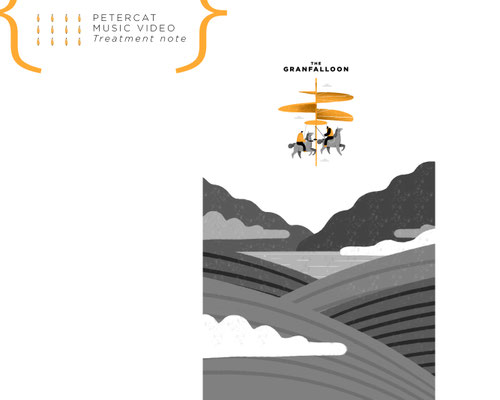
The Granfalloon was conceived as both a philosophy and a place—an identity for a production company that believes great stories emerge from unlikely encounters.
We shaped the brand around the idea that it is a state of mind and a gathering point: one that draws together people who, under different circumstances, might never have met. Directors, writers, technicians, performers, and wanderers—connected not by sameness, but by curiosity.
Anchored in the provocation “be the strange you want to see in the world,” the visual and verbal language celebrates the off-beat, the experimental, and the unorthodox. Instead of smoothing edges, the identity amplifies them—turning eccentricity into an invitation and difference into creative fuel.
The result is a brand that feels porous, magnetic, and quietly rebellious: positioning The Granfalloon not just as a production house, but as a cultural node where unusual minds collide and new narratives take shape.
Credits : Ayesha Punjabi
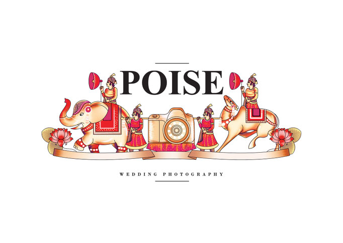
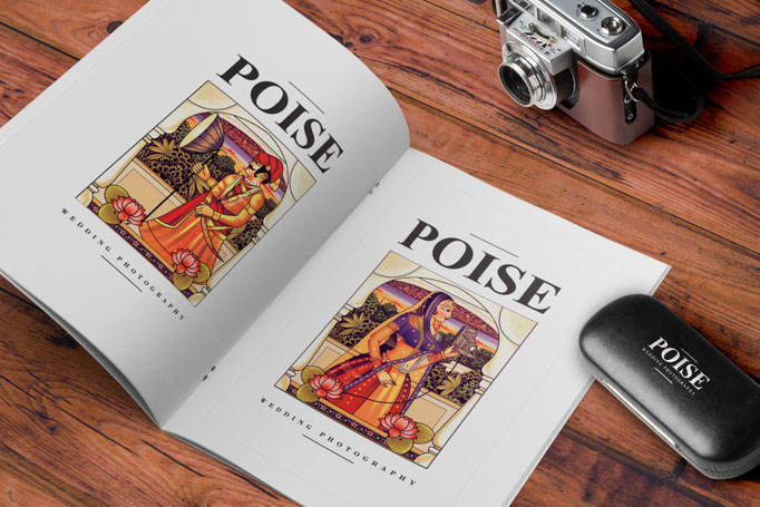
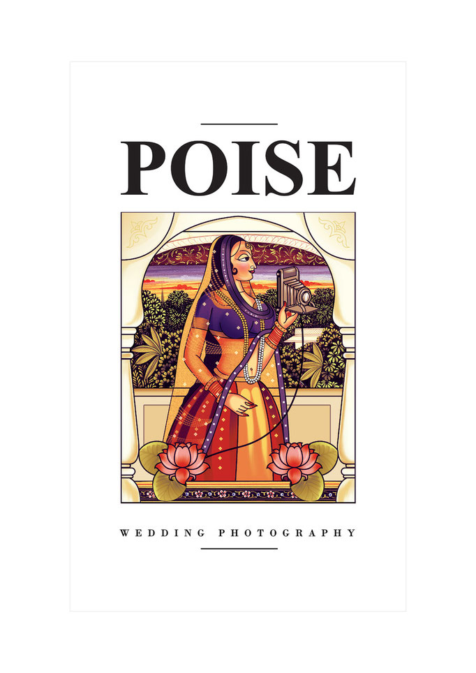
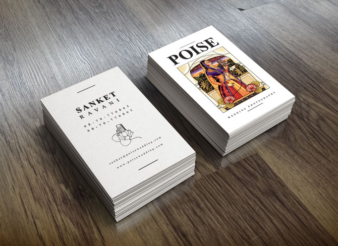
Poise
Highly acclaimed professional Wedding Photographer Sanket Rawani offers a specialist wedding photography service.
The story of your wedding day is captured using natural, contemporary and traditional styles of photography.
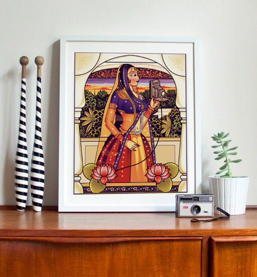
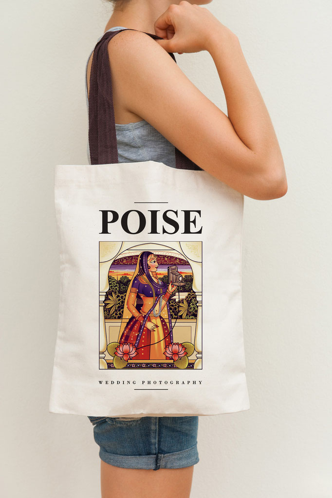
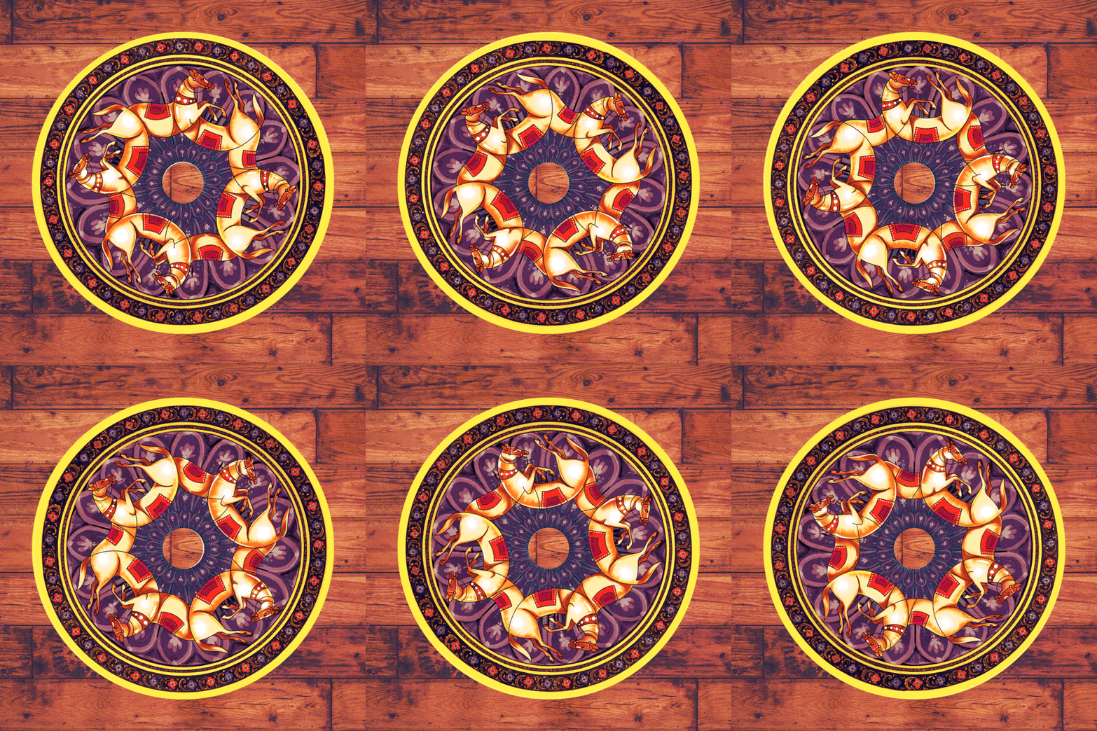
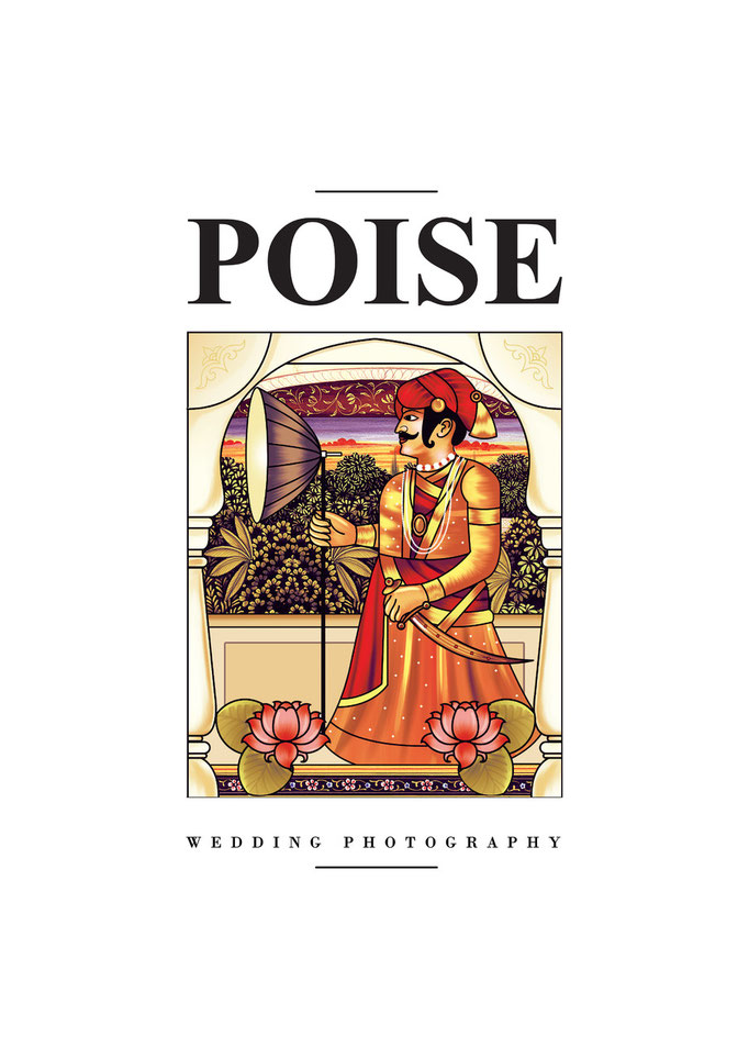
The identity extentions is a fusion of indian classical Miniature paintings and photography

In book winner for Visual Identity Scheme for Startups,
at Kyoorius design awards 2015.

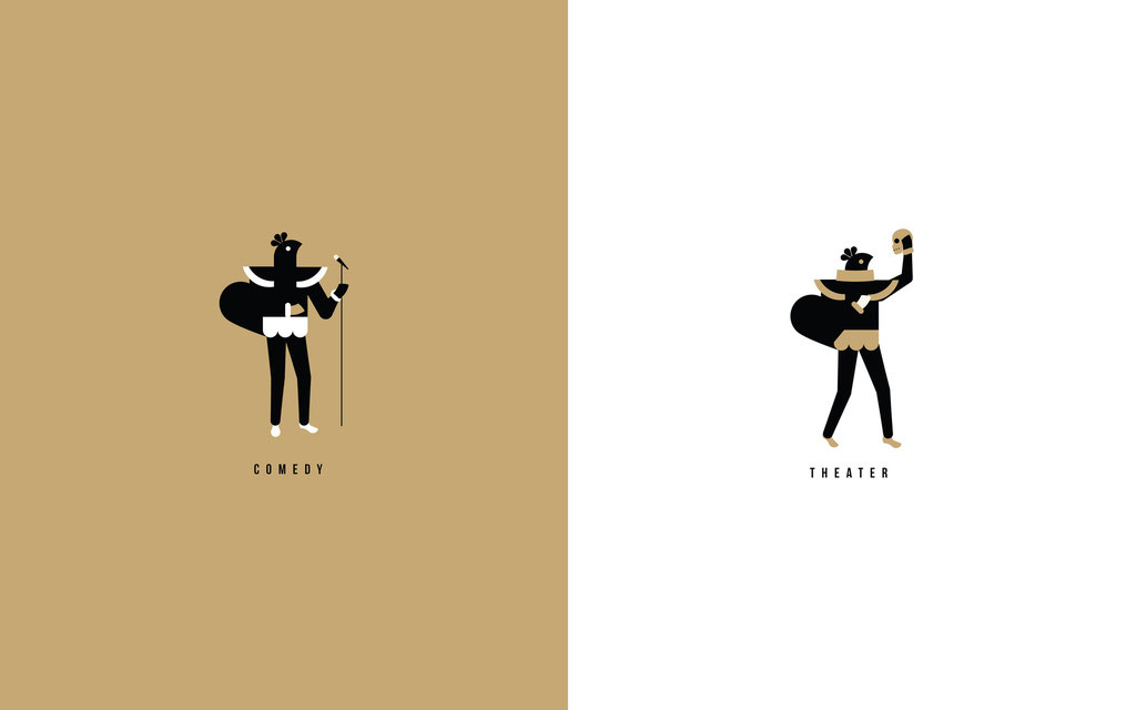
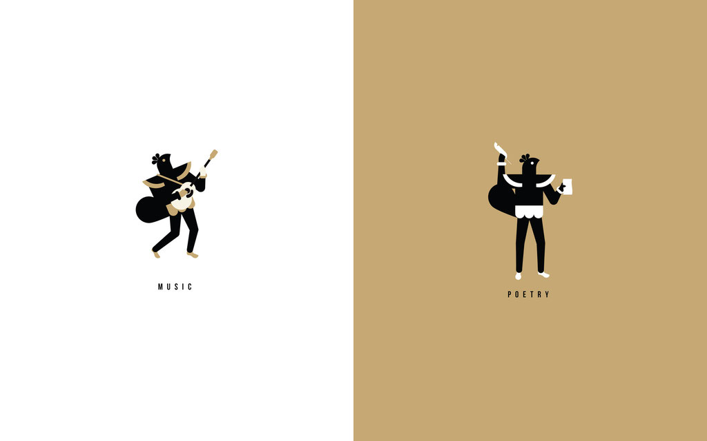
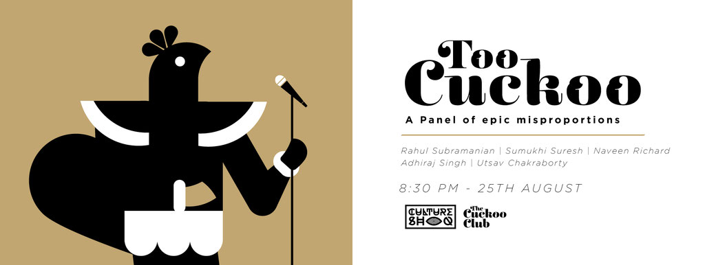
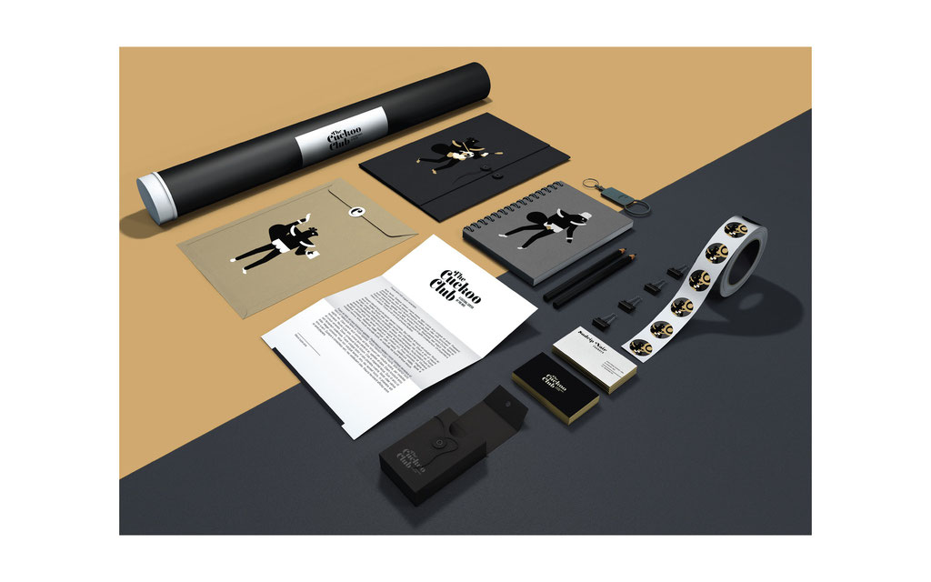
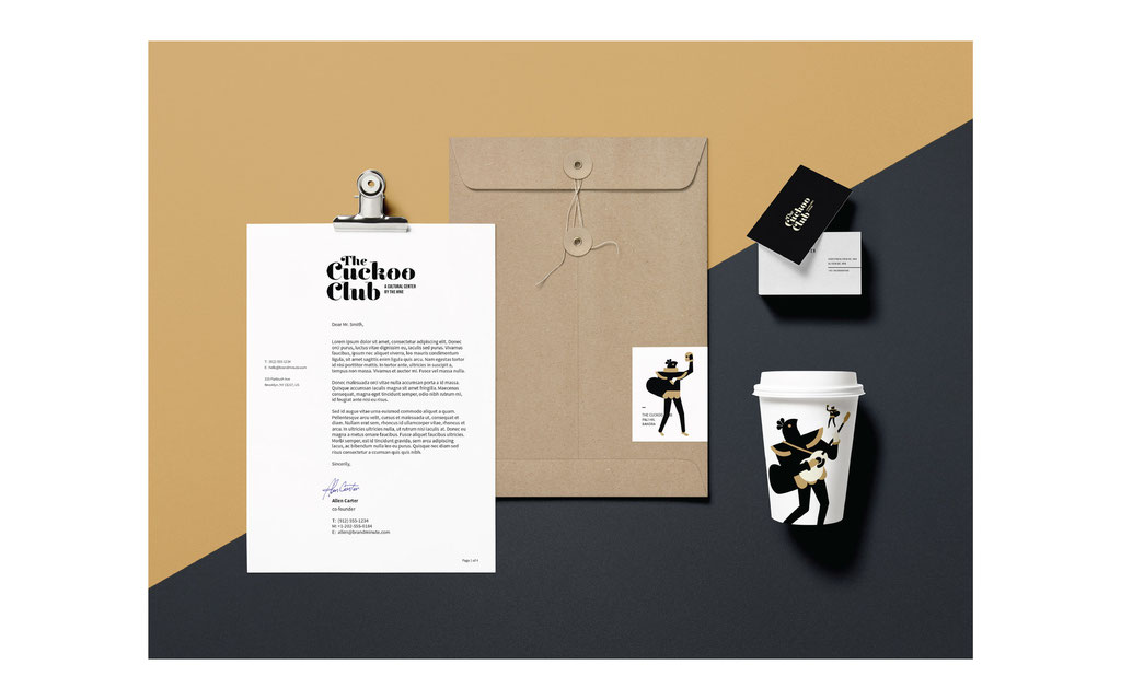
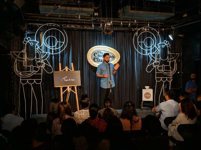
The Cuckoo Club
A community center by HIVE.